Graphs...
Here you will find comparative histograms of the data collected for books and movies.
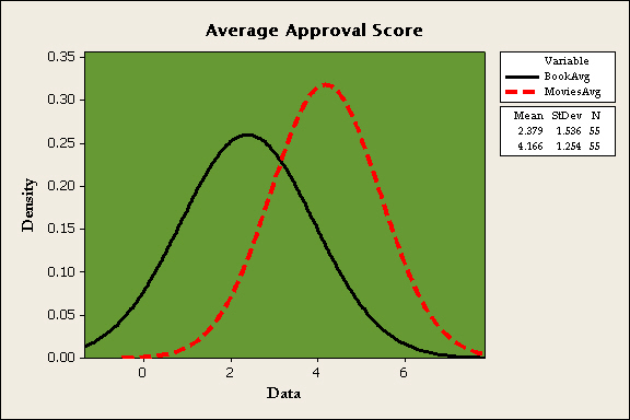
Comparative Histogram
As you can see here, the black line represents Books Average score while the red dotted line represents Movies Average score. The center of the curve representing Movies is farther to the right than that of the other curve. This means that the mean approval score for the movies is greater than the mean approval score for books.
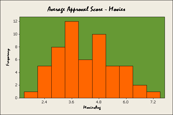
The following are separate histograms of data.
Books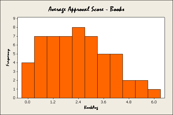
Movies