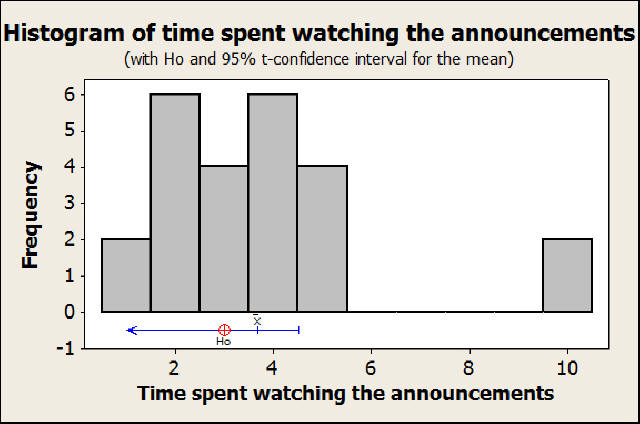
 In
the first graph, we see the histogram of our entire data
that we sampled. Underneath the histogram, but still in the
same graph is our t-test hypothesis (at 3.0) and our
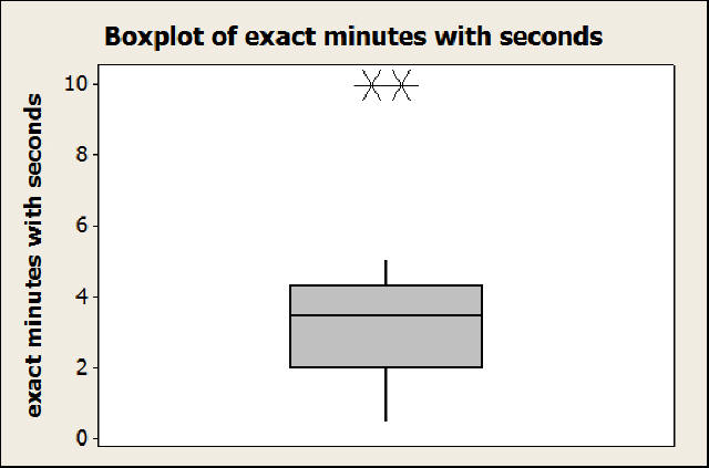
results. To show whether or not our sample is normal, the
second graph is a boxplot of the same data with the two
outliers shown at 10. We also have descriptive
statistics that we can show from a minitab output:
In
the first graph, we see the histogram of our entire data
that we sampled. Underneath the histogram, but still in the
same graph is our t-test hypothesis (at 3.0) and our
results. To show whether or not our sample is normal, the
second graph is a boxplot of the same data with the two
outliers shown at 10. We also have descriptive
statistics that we can show from a minitab output:
Test of mu = 3 vs < 3
95% Upper
Variable N Mean StDev SE Mean Bound T P
exact minutes with secon 24 3.681 2.352 0.480 4.504 1.42 0.915
Variable N Mean StDev SE Mean Bound T P
exact minutes with secon 24 3.681 2.352 0.480 4.504 1.42 0.915