Graphs and Stats
This is the screenshot of what the survey looks like using the google forms website that I did. I put on the 'shuffle option order' to shuffle around the choices to prevent all surveys to start with a certain browser first.

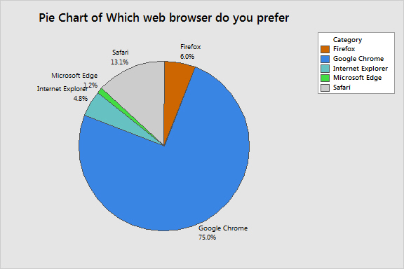
After conducting the study, I placed all of the data I had collected into an excel sheet and later into a Minitab worksheet. I then used Minitab to construct a pie chart and a tally of discrete variables. The pie chart shows that exactly 75% chose google chrome. This is interesting due to the fact that my original question was, "Does the proportion of Google Chrome users exceed 75% of the proportion of users of other web browsers? "
Browser Preferred
Count
Firefox 5
Google Chrome 63
Internet Explorer
4
Microsoft Edge
1
Safari 11
N= 84

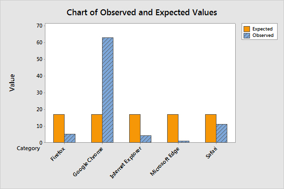
I used those counts listed above to run a Chi-Square goodness-of-fit test for observed counts.
Category Observed Proportion Expected to Chi-Sq
Firefox 5 0.2 16.8 8.288
Google Chrome 63 0.2 16.8 127.050
Internet Explorer 4 0.2 16.8 9.752
Microsoft Edge 1 0.2 16.8 14.860
Safari 11 0.2 16.8 2.002
84 4 161.952 0.000
After running this test, I decided to go a step further and run a confidence interval for one proportion.
Sample X N Sample p 95% Lower Bound P-Value
1 63 84 0.750000 0.660317 0.558
This confidence interval test results in a p-value of 0.558 and so we fail to reject our null hypothesis at the 0.05 level of significance. Therefore there is not enough evidence to suggest that the users of google chrome exceeds the users of other browsers by 75%.