Here are the tests I ran using the program minitab:
————— 5/17/2012 11:42:18 AM ————————————————————
Welcome to Minitab, press F1 for help.
Tally for Discrete Variables: hand, political scale
political
hand Count Percent scale Count Percent
l 11 20.37 1 7 12.96
r 43 79.63 2 12 22.22
N= 54 3 26 48.15
4 6 11.11
5 3 5.56
N= 54
Tabulated statistics: hand, political scale
Rows: hand Columns: political scale
1 2 3 4 5 All
l 2 2 7 0 0 11
1.426 2.444 5.296 1.222 0.611 11.000
r 5 10 19 6 3 43
5.574 9.556 20.704 4.778 2.389 43.000
All 7 12 26 6 3 54
7.000 12.000 26.000 6.000 3.000 54.000
Cell Contents: Count
Expected count
Pearson Chi-Square = 3.382, DF = 4
Likelihood Ratio Chi-Square = 5.115, DF = 4
* WARNING * 1 cells with expected counts less than 1
* WARNING * Chi-Square approximation probably invalid
* NOTE * 6 cells with expected counts less than 5
Tabulated statistics: hand, new scale
Rows: hand Columns: new scale
1 2 3 All
l 4 7 0 11
3.87 5.30 1.83 11.00
r 15 19 9 43
15.13 20.70 7.17 43.00
All 19 26 9 54
19.00 26.00 9.00 54.00
Cell Contents: Count
Expected count
Pearson Chi-Square = 2.996, DF = 2, P-Value = 0.224
Likelihood Ratio Chi-Square = 4.747, DF = 2, P-Value = 0.093
* NOTE * 2 cells with expected counts less than 5
Comments (5) . 05 Jan 2007 . 10:37
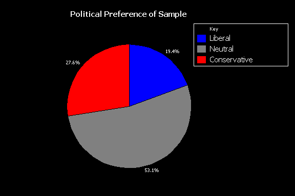
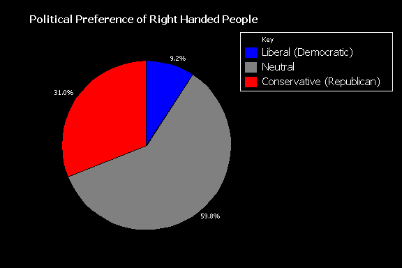
Here are two pie charts visualizing the data:
Note, there is not a pie chart included showing the political preference proportions for left handed people. This is because all of the left handed people that responded, they picked liberal when asked political preference.