Math Portal
Introductory Statistics
Section 4.2 - Displaying Relationships using Scatter plots
Page 1 - Page 2 - Page 3 - Page 4
Let's consider something with which we are all familiar: AGE. Let's begin by asking if people tend to marry other people of about the same age. Our experience tells us yes, but how good is the correspondence? One way to address the question is to look at pairs of ages for a sample of married couples. Table 1 below shows the ages of 10 married couples. Going across the columns we see that, yes, husbands and wives tend to be of about the same age, with men having a tendency to be slightly older than their wives. This is no big surprise, but at least the data bear out our experiences, which is not always the case.


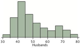
Figure 1. Histograms of spousal ages.
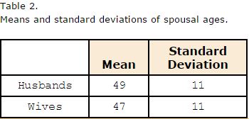
The pairs of ages in Table 1 are from a dataset consisting of 282 pairs of spousal ages, too many to make sense of from a table. What we need is a way to summarize the 282 pairs of ages. We know that each variable can be summarized by a histogram (see Figure 1) and by a mean and standard deviation (See Table 2).

Each distribution is fairly skewed with a long right tail. From Table 1 we see that not all husbands are older than their wives and it is important to see that this fact is lost when we separate the variables. That is, even though we provide summary statistics on each variable, the pairing within couple is lost by separating the variables. We cannot say, for example, based on the means alone what percentage of couples has younger husbands than wives. We have to count across pairs to find this out. Only by maintaining the pairing can meaningful answers be found about couples per se. Another example of information not available from the separate descriptions of husbands and wives' ages is the mean age of husbands with wives of a certain age. For instance, what is the average age of husbands with 45-year-old wives? Finally, we do not know the relationship between the husband's age and the wife's age.
Click here to continue to the next page
Page 1 - Page 2 - Page 3 - Page 4
Let's consider something with which we are all familiar: AGE. Let's begin by asking if people tend to marry other people of about the same age. Our experience tells us yes, but how good is the correspondence? One way to address the question is to look at pairs of ages for a sample of married couples. Table 1 below shows the ages of 10 married couples. Going across the columns we see that, yes, husbands and wives tend to be of about the same age, with men having a tendency to be slightly older than their wives. This is no big surprise, but at least the data bear out our experiences, which is not always the case.


Figure 1. Histograms of spousal ages.
The pairs of ages in Table 1 are from a dataset consisting of 282 pairs of spousal ages, too many to make sense of from a table. What we need is a way to summarize the 282 pairs of ages. We know that each variable can be summarized by a histogram (see Figure 1) and by a mean and standard deviation (See Table 2).

Each distribution is fairly skewed with a long right tail. From Table 1 we see that not all husbands are older than their wives and it is important to see that this fact is lost when we separate the variables. That is, even though we provide summary statistics on each variable, the pairing within couple is lost by separating the variables. We cannot say, for example, based on the means alone what percentage of couples has younger husbands than wives. We have to count across pairs to find this out. Only by maintaining the pairing can meaningful answers be found about couples per se. Another example of information not available from the separate descriptions of husbands and wives' ages is the mean age of husbands with wives of a certain age. For instance, what is the average age of husbands with 45-year-old wives? Finally, we do not know the relationship between the husband's age and the wife's age.
Click here to continue to the next page