Math Portal
Introductory Statistics
Section 4.2 continued - Displaying Relationships using scatter plots.
Page 1 - Page 2 - Page 3 - Page 4
We can learn much more by displaying the bivariate data in a graphical form that maintains the pairing. Figure 2 shows a scatter plot of the paired ages. The x-axis represents the age of the husband and the y-axis the age of the wife. There are two important characteristics of the data revealed by Figure 2. First, it is clear that there is a strong relationship between the husband's age and the wife's age: the older the husband, the older the wife. When one variable (Y) increases with the second variable (X), we say that X and Y have a positive association.
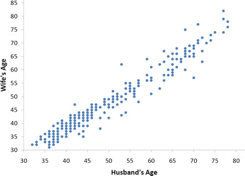
Figure 2. Scatter plot showing wife's age as a function of husband's age.
Conversely, when Y decreases as X increases, we say that they have a negative association. Second, the points cluster along a straight line. When this occurs, the relationship is called a linear relationship. Figure 3 shows a scatter plot of Arm Strength and Grip Strength from 149 individuals working in physically demanding jobs including electricians, construction and maintenance workers, and auto mechanics. Not surprisingly, the stronger someone's grip, the stronger their arm tends to be. There is therefore a positive association between these variables. Although the points cluster along a line, they are not clustered quite as closely as they are for the scatter plot of spousal age.
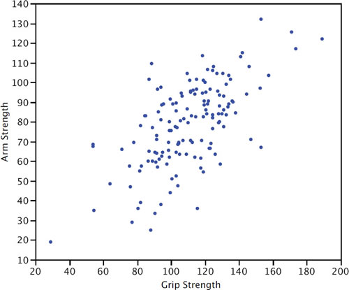
Figure 3. Scatter plot of Grip Strength and Arm Strength.
Not all scatter plots show linear relationships. Figure 4 shows the results of an experiment conducted by Galileo on projectile motion. In the experiment, Galileo rolled balls down an incline and measured how far they traveled as a function of the release height. It is clear from Figure 4 that the relationship between Release Height and Distance Traveled is not described well by a straight line: If you drew a line connecting the lowest point and the highest point, all of the remaining points would be above the line. The data are better fit by a parabola.
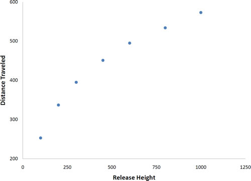
Figure 4. Galileo's data showing a non-linear relationship.
Click here to continue to the next page
Page 1 - Page 2 - Page 3 - Page 4
We can learn much more by displaying the bivariate data in a graphical form that maintains the pairing. Figure 2 shows a scatter plot of the paired ages. The x-axis represents the age of the husband and the y-axis the age of the wife. There are two important characteristics of the data revealed by Figure 2. First, it is clear that there is a strong relationship between the husband's age and the wife's age: the older the husband, the older the wife. When one variable (Y) increases with the second variable (X), we say that X and Y have a positive association.

Figure 2. Scatter plot showing wife's age as a function of husband's age.
Conversely, when Y decreases as X increases, we say that they have a negative association. Second, the points cluster along a straight line. When this occurs, the relationship is called a linear relationship. Figure 3 shows a scatter plot of Arm Strength and Grip Strength from 149 individuals working in physically demanding jobs including electricians, construction and maintenance workers, and auto mechanics. Not surprisingly, the stronger someone's grip, the stronger their arm tends to be. There is therefore a positive association between these variables. Although the points cluster along a line, they are not clustered quite as closely as they are for the scatter plot of spousal age.

Figure 3. Scatter plot of Grip Strength and Arm Strength.
Not all scatter plots show linear relationships. Figure 4 shows the results of an experiment conducted by Galileo on projectile motion. In the experiment, Galileo rolled balls down an incline and measured how far they traveled as a function of the release height. It is clear from Figure 4 that the relationship between Release Height and Distance Traveled is not described well by a straight line: If you drew a line connecting the lowest point and the highest point, all of the remaining points would be above the line. The data are better fit by a parabola.

Figure 4. Galileo's data showing a non-linear relationship.
Click here to continue to the next page